WooCommerce Storefront Checkout Customiser
$19.00 Original price was: $19.00.$5.00Current price is: $5.00.
Optimise conversions with the Storefront Checkout Customiser
The checkout is arguably the most crucial page at your store to get right. Doing so however is not an exact science. There are general best practises but each store and each stores audience is unique. The Storefront Checkout Customiser allows you to tweak the checkout by choosing a different layout and removing distractions to find out what works best at your store. Try different combinations of settings to A/B test and improve conversions.
Features
Once installed you’ll notice a new top level ‘Checkout’ section in the WordPress Customizer:
Checkout Layout
Here you can specify a preset layout option for your checkout.
The options are:
- Default – the default layout
- Stacked – Stacks the address inputs and order review atop one another
- Two column addresses – arranges the address inputs in to two columns above the order review
When combined with the full width template already available in Storefront core this allows you to create 6 different checkout designs.
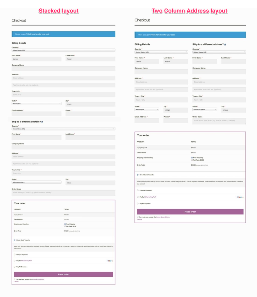
Stacking the checkout components provides a streamlined checkout process which could work great for stores that do not require a delivery address for example.
Arranging the address fields into two columns gives the visitor exact knowledge of what is required of them on page load.
Distraction free checkout
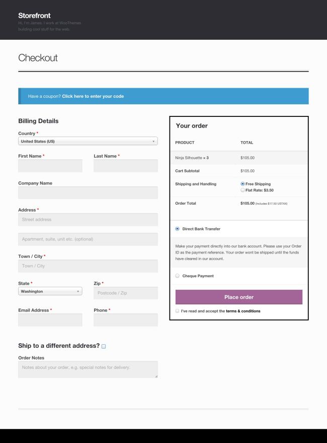
Increase your conversions with the Distraction Free Checkout. This feature removes all clutter from the checkout, allowing the customer to focus entirely on that procedure.
Two page checkout
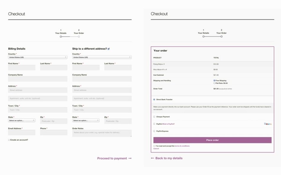
Sometimes a checkout screen containing lots of inputs can be daunting and off-putting. The Two page checkout setting separates the customer details collection form, and the order summary / payment details form in to two separate pages making the checkout experience easier to digest.
Be the first to review “WooCommerce Storefront Checkout Customiser” Cancel reply
You must be logged in to post a review.
Related products
WooCommerce Extensions
Products
Management
Import and Export
Products
Management
Products
Management





Reviews
There are no reviews yet.